What’s Changed?
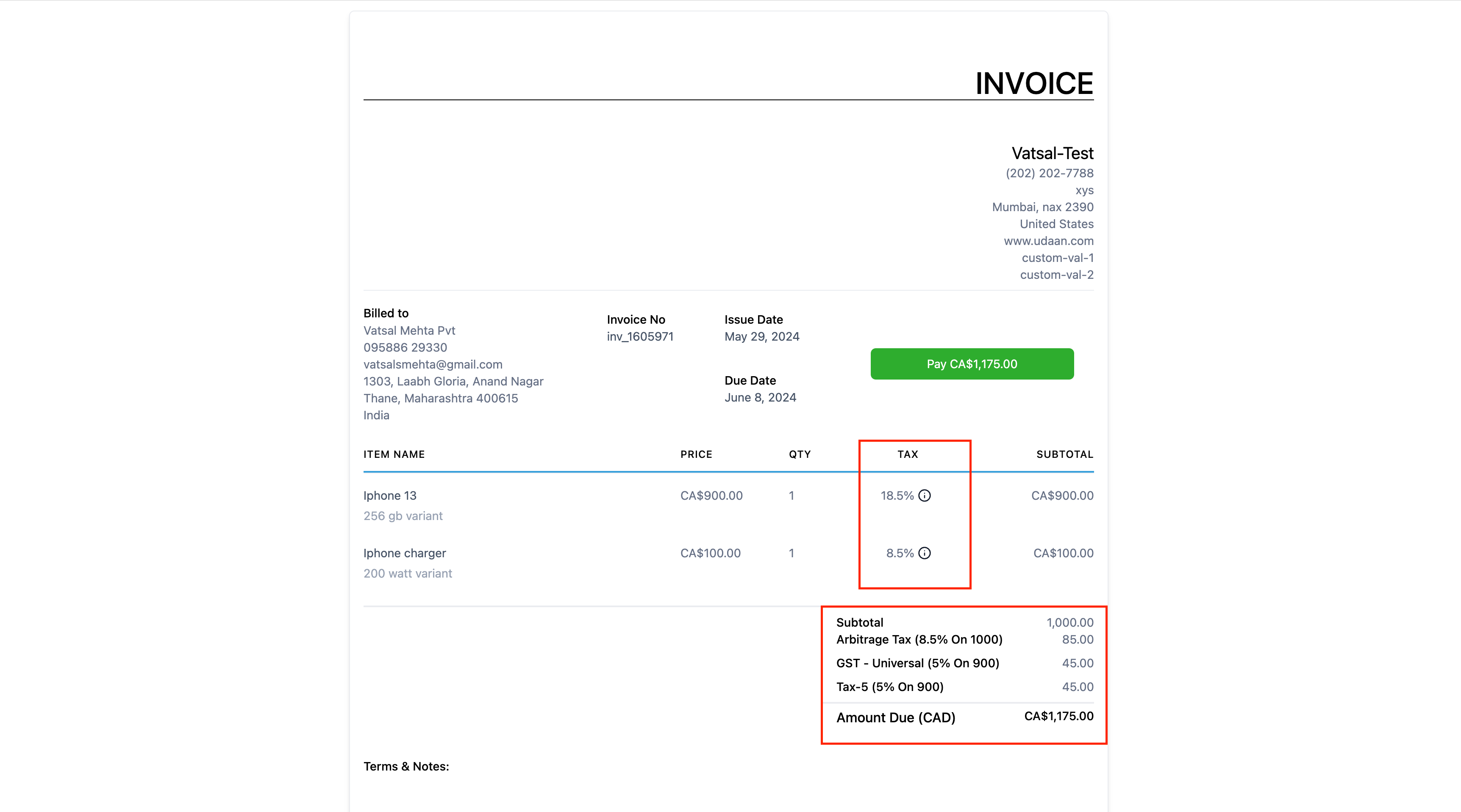
- Earlier we used to display taxes in-line for an item leading to cluttered UI. Moving away from this approach we have introduced a new column which shows up cumulative total of the taxes summed up.
Detailed Breakdown of Taxes
- Now in the OrderSummary we have a detailed breakdown of taxes and how the calculation was done to end tup to that particular value.
- We have also added in a tooltip which now on hovering gives details of all the taxes applied for that particular invoice item.
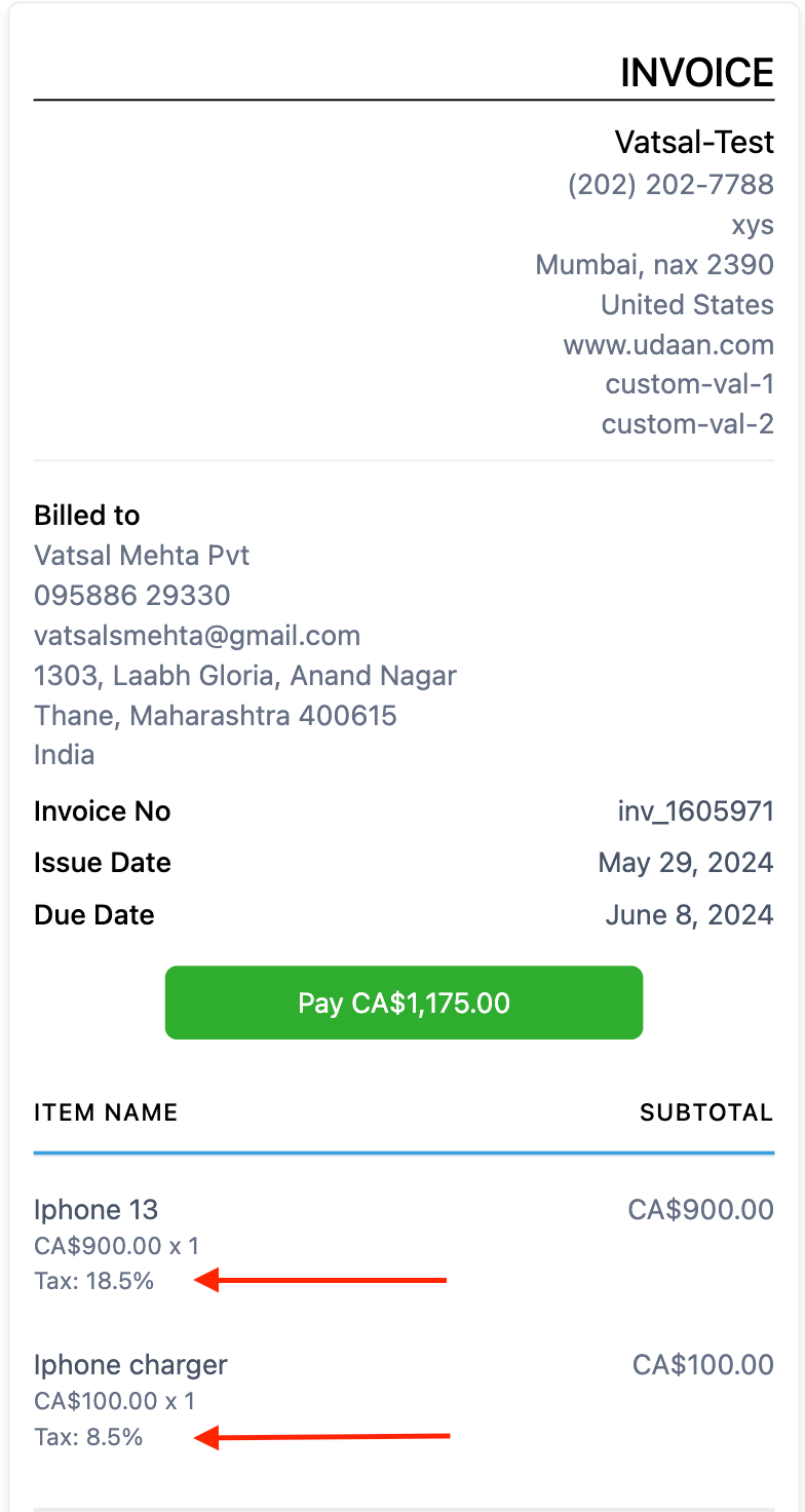
- We have also introduced changes in the mobile view of the invoices where we have now cleared up the clutter and added in a single line which displays the total tax.
- This is in addition to the taxes breakdown in order summary also available for mobile view.
The scope of this release includes changes at the following places – >
- Invoice Builder
- Invoice Template Builder
- Invoice Preview Link (Live Link) – both desktop and mobile view
How it helps
- Improved & Clutter Free UI
- Visibility to the End Customer
- Responsive / Mobile Friendly Changes
Note – This new UI would be applied on already created invoices too.
Where to Find the Changes
- Go to Payments -> Invoices
- One can go to any invoice editor by creating a new invoice or editing an existing one and can see the newly introduced tax column
- One can even open the preview of the invoice created and see the revamped tax UI there


